About the project and the client#
Build an intuitive product based on the Client's market knowledge that improves the in-home care market by effectively connecting people who need support with matched local caregivers nearby — in minutes, no middlemen, saving both sides time and providing a clear insight into the details of the matched profiles.
The collaboration was at a very high level from the very beginning. What I appreciate most is their professionalism, commitment and constant contact at every stage of the project. I always knew where the work stood, and every matter was discussed on an ongoing basis.
What impressed me most was the way they approached my ideas. I could freely present my vision, even when it wasn't fully refined, and they were able to translate it into concrete solutions and propose their own, often even better concepts.
What we tackled#
Opiekly operates in an area that combines sensitive data, two different types of users and a complex process of matching a caregiver to a family's needs. The key challenges were how to simplify a very complex choice of caregiver, how to handle data safely, and how to design one product for two different roles.
How do you compare criteria that aren't comparable?
A family looking for a caregiver weighs many things at once: the scope of help, experience, localization, availability and specific health needs. The challenge was that these criteria don't share a single "weight" — different users may value them differently. So we had to design a way of presenting results that doesn't oversimplify the decision.
Sensitive data in the app
The app works with data such as health information, address and contact details. The challenge was how to show the user enough to make a decision, while not exposing that data to unnecessary exposure or misuse.
When to create the account in the profile wizard?
Onboarding had to balance an easy start with the need to verify the user. Creating the account too early discouraged users; too late meant losing their data and any way to contact them. The goal was to find the moment when the user is already engaged, but not yet "overwhelmed" by formalities.
Two roles in one app
The app serves two different types of users: families and caregivers. The challenge was that, despite a shared system, both groups have different needs, different information and a different way of using the product — which had to fit into one coherent experience.
Throughout the collaboration I had the sense that for every issue we could find a solution together. I never once heard that something „can’t be done” — the team always looked for a way to achieve the intended result. Their professional approach mattered most to me and gave me great comfort and trust.
Got a similarly complex project? Let's talk.
Matching, roles, sensitive data and scale — we know how to wrap it all into one coherent product.
How we approached the project#
Four principles we followed: the client first — a long-time industry practitioner, then code. Simple, effective design — many people in the target audience don't use complex apps day to day. Every stage delivered end-to-end — database, server and a working screen in the browser — so the client sees a working feature, not a sketch. We ask when we don't know — because we care about the best product, not a flashy demo.
Setting the direction together with the client — an industry practitioner
Before we started, together with a client who has many years of experience in the care industry, we refined the product scope: the lists of care tasks, medical conditions and the optimal user journey — from the family describing the need, through the caregiver's profile, to contact. We also agreed on a shared domain language, which significantly sped up the later stages.
Simplicity and intuitiveness of the interface
We design for users who often don't use apps day to day — on both the family and the caregiver side. That's why every screen has to be understandable right away. Instead of elaborate forms, we use short steps, plain language and one primary action per screen. Here simplicity isn't an aesthetic touch, but a condition for fitting the target audience.
A working feature at the end of every iteration
Every update is a working feature in the browser, not a static demo. The process runs on a short loop: presentation, feedback, iteration. Each module is delivered in full — together with the database, interface and tests. Integration happens continuously, without deferring it to later stages.
Ongoing client contact and early validation of assumptions
We treat the client's industry knowledge as our compass, so we stay in constant contact on an always-open line. We regularly present progress and validate assumptions before going deeper — reducing the risk of major changes at advanced stages, and quickly incorporating suggestions and discussing ideas.
Key views#
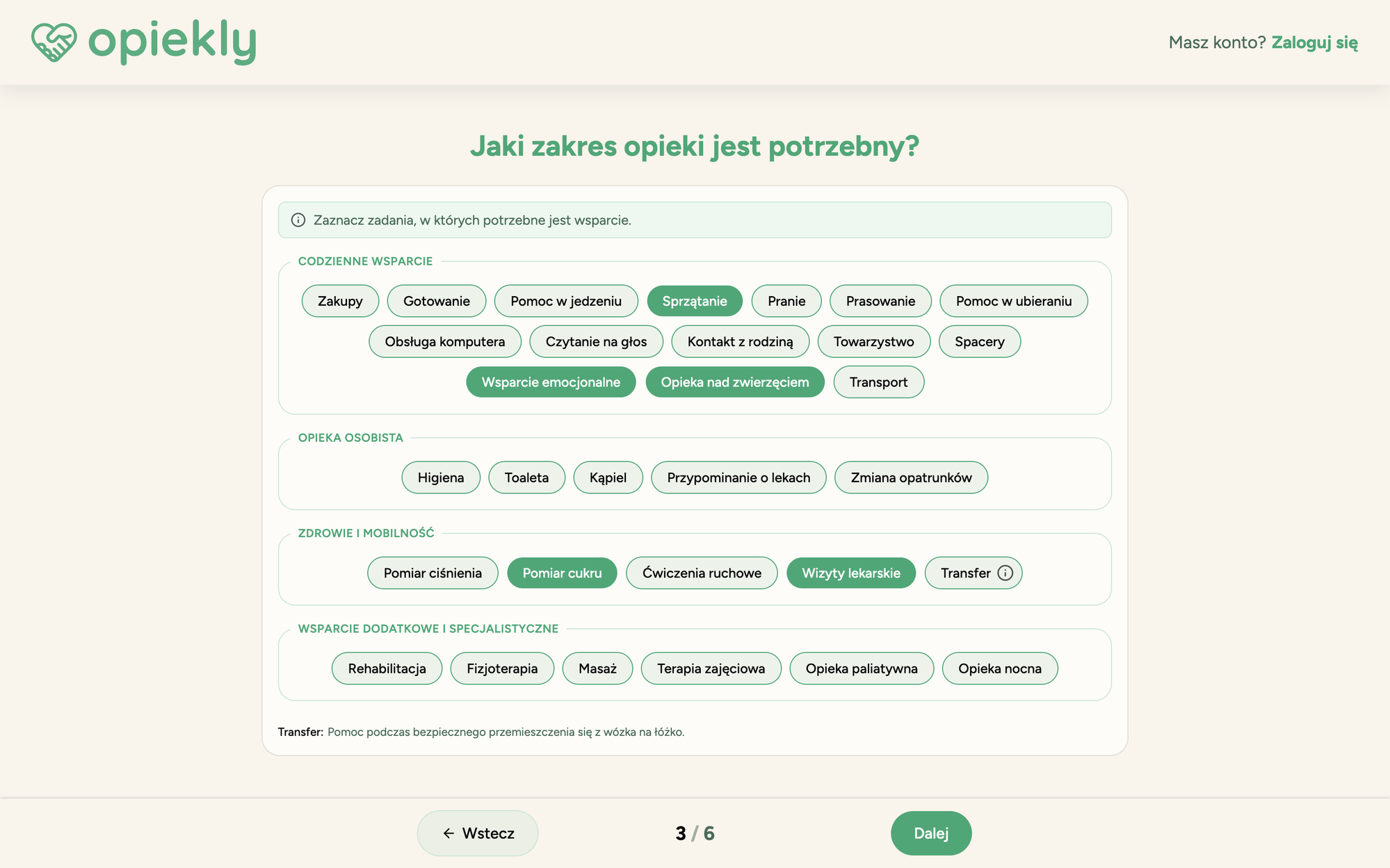
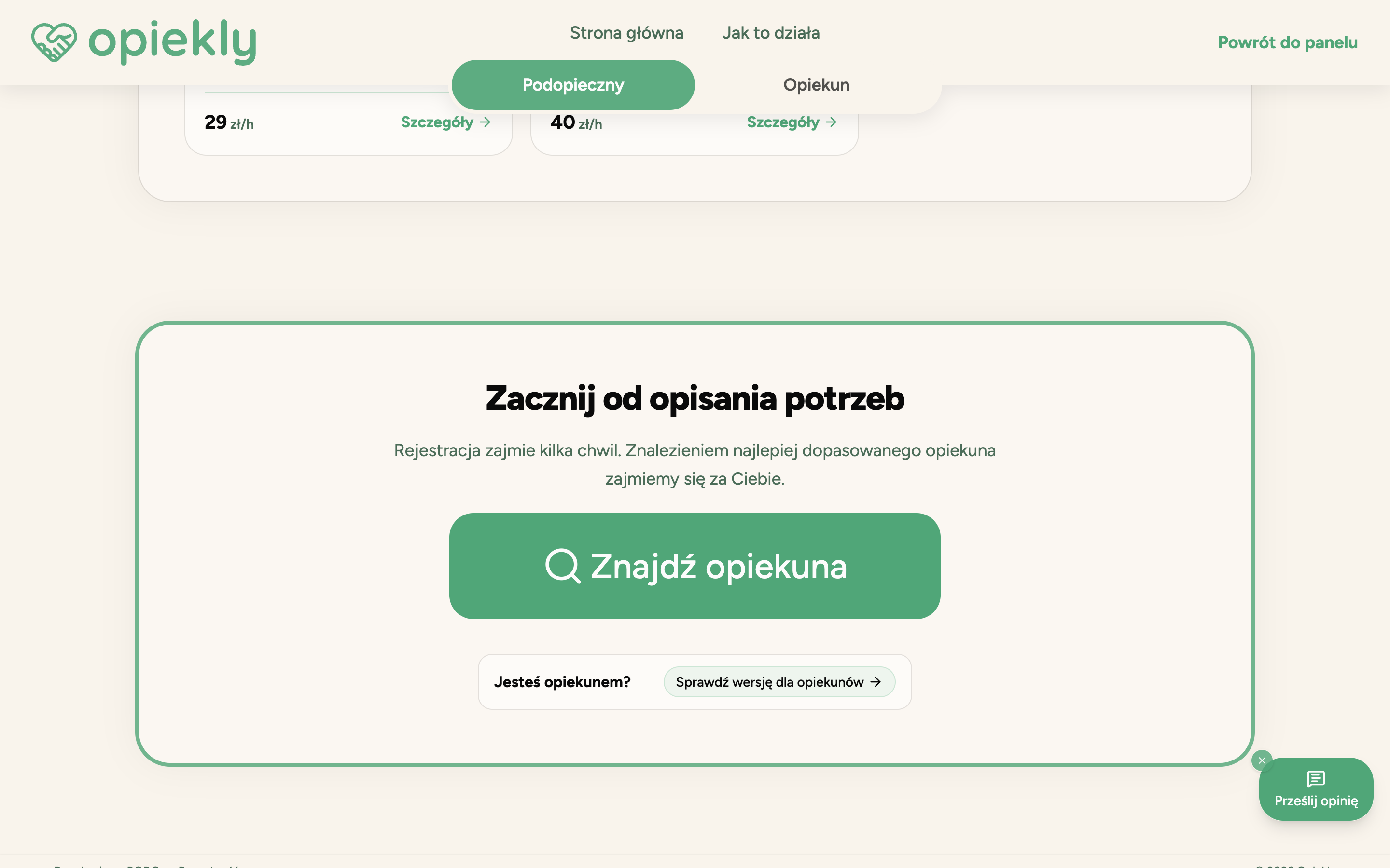
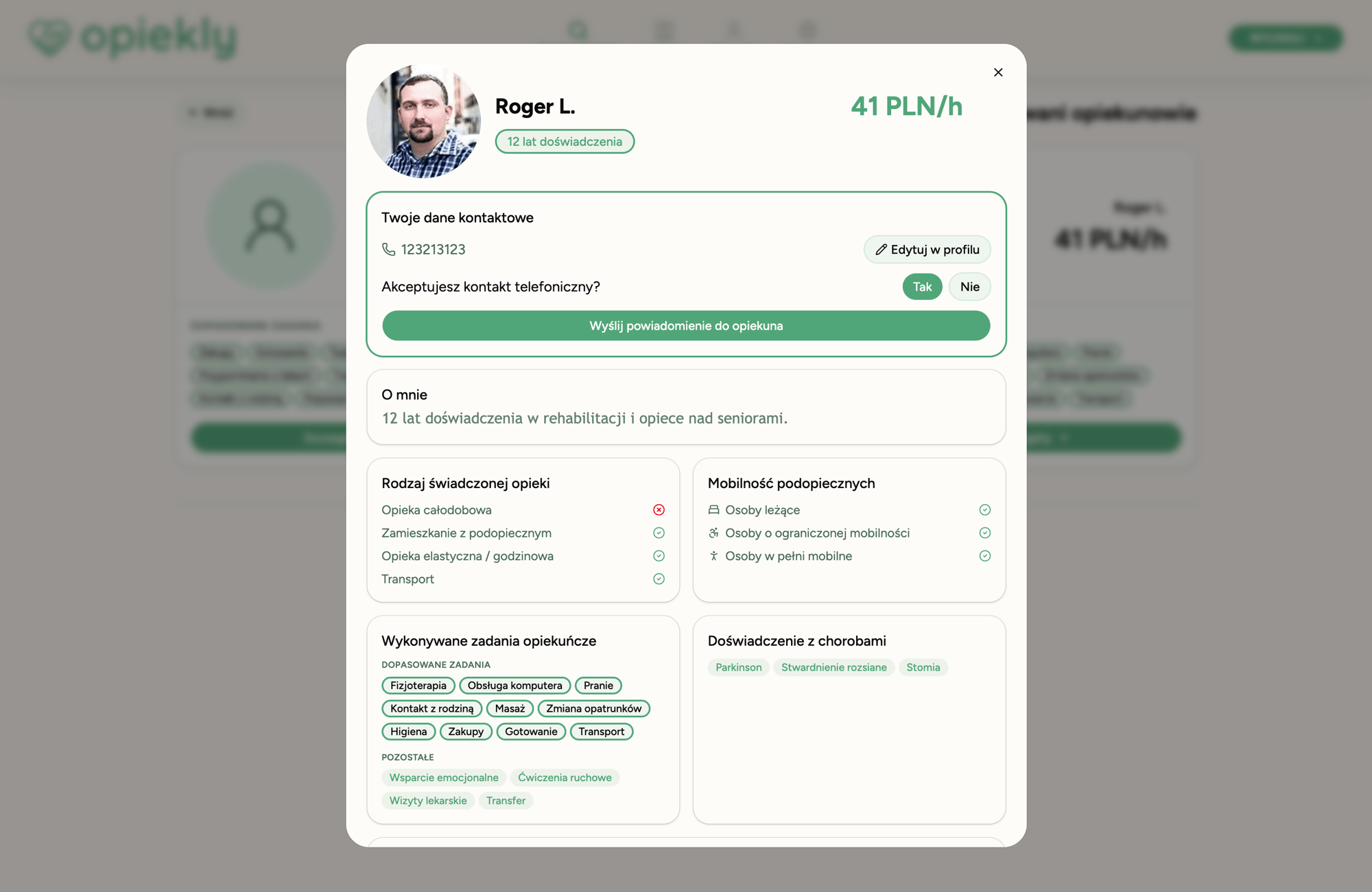
The registration wizard is one continuous view split into several steps — from choosing the role and care type, through mobility and task scope, to the address with a service radius. The wizard looks different for the caregiver and the care seeker — each role has its own path. Below are a few selected views from the wizard.
What we delivered#
A web platform ready to launch, with the full flow for the family and the caregiver — covering registration, matching, secure accounts and contact between users.
I can wholeheartedly recommend this team to anyone looking for a partner who will not only build an app or write software, but also bring their own experience, knowledge and commitment as an invaluable asset to the project.
Want similar outcomes at your company?
Initial analysis and estimate within 48h. No obligations — the first step is always on us.
Decisions that made the difference#
The technical decisions that shaped the system's quality the most. A modern but standard stack — no exotic dependencies, easy to maintain and audit.
API generated from OpenAPI instead of hand-maintained contracts
NestJS generates the OpenAPI spec from controllers and DTOs, and the frontend consumes an automatically generated client (TypeScript, React Query, Zod). OpenAPI becomes the single source of truth.
A contract change in the backend immediately triggers a compile error in the frontend, eliminating type drift and runtime bugs.
Matching logic moved into the database layer
The algorithm (filters, haversine distance, task coverage and ranking) runs in a single SQL query. The app receives an already-sorted result, with no extra processing in JS.
This removes data-transfer cost and keeps things scalable as the number of caregivers grows.
Sentry as the source of truth for application stability
Sentry monitors runtime errors on the frontend and backend. It answers the stability question: what breaks, where in the stack, for how many users, in which version.
Source maps and a Sentry tunnel provide readable stack traces and bypass adblockers, so the error picture reflects the real user population.
PostHog as the measure of product usability
PostHog analyzes user behaviour and conversion in the product. It answers the usability question: which paths work, where users drop off, which features actually get used.
Shared event definitions live in a shared enum, which eliminates analytics drift between frontend, backend and dashboards.
Feedback collected at points of real product interaction
Surveys fire after key actions (e.g. sending a request, revealing contact), instead of permanent widgets.
It runs in two modes: with consent (full PostHog integration) and without consent (anonymous events with no user identification and no way to link sessions).
Tech stack#
Library choices around the decisions above. Standard, well-maintained, no abandonment risk.
FRAMEWORK · NAVIGATION
LANGUAGE
UI & STYLING
STATE, DATA & CODEGEN
BACKEND & DB
AUTH · NOTIFICATIONS
OBSERVABILITY & ANALYTICS
INFRA & DEVOPS
Environments and paths to production#
Four environments, each with a different trust scope. Build and deploy automated through GitLab CI/CD, image tags immutable per commit — a running image can never be accidentally overwritten.